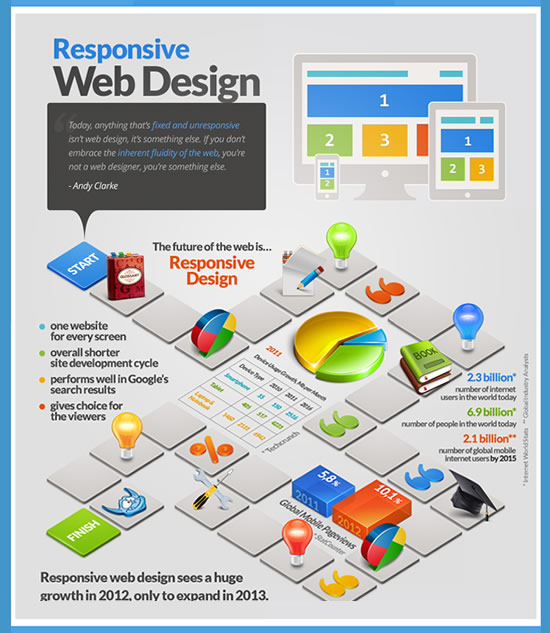
An Infographic on Responsive Web Design
To add the above image to your website, please copy and paste the code below.
The web is ever-changing, and web designers must be prepared to meet this challenge with fluid and responsive designs for web sites. Responsive web sites conform to the conditions present on the user’s computer: for example, a responsive web site can resolve graphics in a number of pixel configurations to ensure that each user is receiving quality graphics, no matter what the resolution of his or her screen.
This is especially important considering the wide range of screen resolutions on the market today. The explosion in popularity of hand-held devices and tablets mean that many of your customers are no longer looking at your website on a large screen. If your graphics cannot conform to this new technology, you will find that you are losing business.
This infographic contains pertinent information about data visualization. Basic theory, the use of a calendar, helpful hints, articles and tutorials are all contained in the graphic’s information in an easy-to-find and easy-to-read format that users are coming to expect in infographics.
Note that the focus is on fluidity. As the graphic points out, if it is not fluid, it is not web design. Today’s users, especially with smart phones and tablets, demand responsive web design. If your web page is static and dated, they will go elsewhere. This is why it is so important to incorporate responsive design elements into your website’s structure.
If you think this is unnecessary, think again. As the graphic shows, the world population is approximately 6.9 billion. Of those people, at least 2.3 billion, or one-third, are already on the internet. Furthermore, in 2013 the number of people using some form of mobile Internet access is expected to reach 2.1 billion. Clearly, you cannot afford to ignore this important marketplace if you want your business to thrive and grow.
Responsive web design centers on user choice. A study done many years ago—before internet design became a watchword—showed that people who visited a hotel expressed much more satisfaction with their stay if they were given a choice of rooms at check-in. It did not matter that the rooms were identical; it was a psychological satisfaction people received from having access to choice that prompted the positive response. Why would you think your customers are any different? If you know they like choice, give it to them—by incorporating responsive web design into your overall advertising plan.
A responsive web designer is one who can be flexible to the changing needs of a web-user population. The changes over the past few years in that population have been numerous, but they are just the beginning. A smart web designer responds to those needs and incorporates them into his or her work.
At Orange County SEO, we understand responsive web design and interactive web features. We can review your site and suggest changes that will boost your customer traffic and drive more sales. Contact us today to find out how we can help you achieve your marketing goals.


