Orange County SEO™ Blog
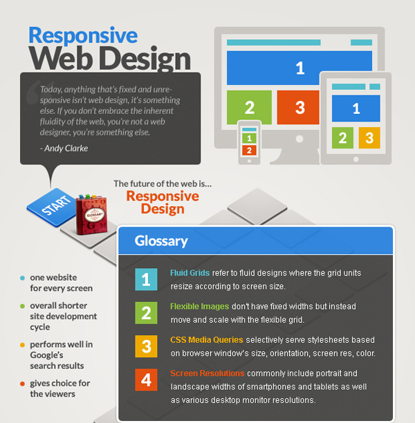
Interactive Formats & Responsive Design Infographic
Since at least three-fourths of the population consists of what is known as “visual learners,” it is important to consider the visual aspects of data presentation when creating a website. In simple terms, most people respond to a graphic far more readily that the written word. Reading long paragraphs is boring; looking at an exciting colorful infographic is much more fun.
This infographic deals with what is called “responsive design.” In order to understand responsive design, it is necessary to go back to school—no, don’t worry, we won’t be there long!
Educators discovered many years ago that not every child learns in the same way. They began to study how each individual learned, and they found that there were a number of different “learning styles.” With this knowledge, teachers began to make lessons that covered the same material but delivered it in different ways. This process is known as “differentiation” in educational settings and is used today to reach students of all learning types.
The same general idea can be applied to responsive design in website building. It is important that website builders understand and respond to user needs. In other words, website builders must go through the same process teachers went through years ago; recognize and change their practices based on the various needs of users.
Fortunately, designing responsible websites with interactive formats is not as difficult as keeping a roomful of third-graders quiet! It simply requires analysis of what works for users and changes to incorporate those techniques.
A good example of this can be found with interactive forms. Many websites feature forms for users to fill out so that the owner can capture visitor information for future contacts, mailing lists and other purposes. However, many website owners or designers never consider how visitors respond to these forms and how many of them simply “click out” before filling out the form.
Think about your own experience. How invested do you have to be before you are willing to spend your time filling out a website form? For most people, the answer is that you have to be ready to buy. Introducing a long form before that point in the sales funnel can drive away a lot of business from a website, and if the designer or owner does not study these results, he or she will never know how close the customer was to buying before turning to an easier-to-use website.
This situation is what is meant by a responsive design scenario. A website owner or designer looking at the reality of visitor experience to the site could easily decide to move the form-filling process to a later point in the sales funnel and to replace it with an engaging, interactive module that builds a desire in the customer to purchase. In this way, he or she is much more likely to fill out the form at the end and to ultimately make a purchase.
Orange County SEO can help you analyze your website and take advantage of interactive and responsive design. Call us today for more information.


